
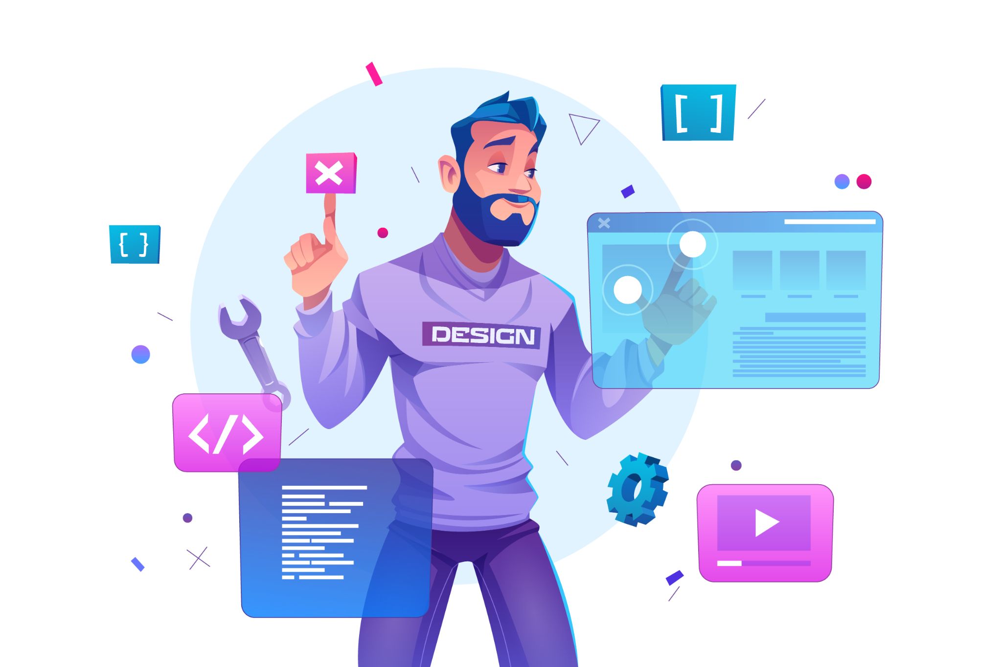
Site design must be elaborate, and it doesn’t matter if it’s a streaming service like Netflix or a betting platform like 22 Bet Nigeria. Want to improve it? Then follow these easy tips.

Good Page Load Speed
It would seem, what does web design have to do with it? Let’s explain. Many professionals are so fond of graphic experiments that do not pay attention to download speed. And it, if you stuff the site with widgets, animation, and video, will inevitably fall. If the site is loaded slowly, not every visitor has the patience to wait, half simply leave your site, before anything to see. On the other hand, no one will read a dull gray sheet of text, if you do not have Wikipedia.
Think about what’s more important to you: visuals or speed. We advise to look for the happy medium: graphics, of course, are in need but ask the designer to act without fanaticism. And make the site on a good engine.
Usability of the Site
Your site can be modern and beautiful, but what good is it if it is hopelessly, desperately uncomfortable? By usability, we mean the convenience of the platform for the visitor. For example, he enters the main page and sees a brief description: aha, this online sporting goods store, everything is clear. He wants to see the menu, it’s all sorted out: here’s the catalog, here are the terms of the order, here is information about shipping and contacts. He goes to the catalog, sees the categories and subcategories of products. If the site has the rule of three clicks (to get to the desired item, the user should make not more than three clicks), it’s great.
Let’s move on. The site has a search box, and it’s great. A person can find the right product at a moment’s notice. There is a large button-cart, as it should be in the upper right corner, visible from every page? Wonderful: the visitor does not have to go back to the home page and look for the cart among the icons and menu items.
If it’s not there, the site is uncomfortable, and the visitor is likely to leave it and look for another one where the usability is taken care of. No one will sit and figure out where the Sales section is on the site. It’s easier to close the tab and go back to the search engine.
Readable Fonts
The era when the more ornate the fonts, the cooler it was has gone. There were times when the letters were so intricate that words just could not be read. And the standard fonts were overlaid with effects and colors. Now the trends have changed: the simpler the fonts, the better. Look at how the sites of large companies and online stores work. They use large readable fonts, which even a baby can understand.
Another rule: the page should be no more than 2-3 different fonts. If more, it borders on blatant and tasteless. It’s allowed to use one font in the logo, the offerer – the second, in the text – the third, and that’s enough.
Moderate Color Palette
There must be no more than 3 colors on the page. Shades and halftones are also allowed but no more. Black, red, yellow and green – it’s too much: have pity on the poor visitor. For a riot of colors, he just does not notice the useful information or not wade through your traffic lights with a magnifying glass in his hands. Furthermore, it’s better to understand color psychology to choose the right palette.
Modern Background
Another hello from the nineties: the complexly composed background for the site. It is still in use among amateur web designers, on budget second-and third-level domain sites.
It’s naive to think that if you sell jewelry – the background should go gold placers, if products – piles of food. It’s all too obvious and banal. No, the pictures in the theme are always relevant, but for the background, it is better to choose something unusual, offbeat. Clean tones and gradients, three-dimensional images, virtual reality are trendy now.
Adaptive Layout
The designer should be able to make an adaptive layout. Not just a mobile version, but an adaptive version that displays equally well on all devices. More and more people are accessing sites with smartphones and laptops. It’s important that the site loads and reads perfectly. You should also pay attention to the fact that the same site may display differently even on different browsers. So, you need to check the layout of the future site on each browser and device.


