With the internet moving faster than it ever has and more websites popping up than ever before, it is important to stay up to date with the latest web design trends to make sure your site is as modern as can be. While your site’s modernization is obviously going to be based on how your customers tend to shop, it is always a good idea to stay up to date-for SEO’s sake. To help get your site as current as can be, we are going to learn more about the top 10 web design trends for 2023.

1. Mobile Centric
Perhaps one of the most important aspects of any website in 2023 is going to be how mobile-friendly it is. Over the past decade, we have seen a serious shift from a majority of desktop visits to mobile visits increasing. This has led Google to put priority on the search engine results page for mobile friendly sites. Having a mobile-friendly site also presents a better customer experience which is going to help your users convert and stay on your site for longer periods of time.
2. Personalized Illustration Designs
A big player in 2023 web design is going to be the use of personalized illustration designs. If you have never seen one, personalized illustration designs consist of designs that look to be hand drawn, giving a more cartoonish look to the page. While this may seem like a gamble, it has been paying off greatly for many bigger brands as more and more people gravitate to the new, more personalized look. To get this look, you may have to employ a graphic designer to get the best look.
3. Responsive Designs
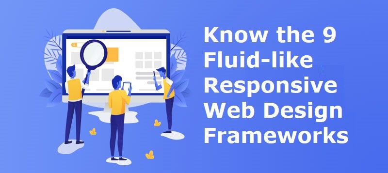
Just like the tip about being mobile-friendly, having a responsive site is going to be highly important when it comes to user experience. Responsive design refers to having your site respond to browser screen changes such as that of a mobile phone. A responsive site, for the most part, keeps your site looking just about the same on mobile as it does on desktop. Sometimes lesser important features are left off of the mobile version to help keep the most important buttons fully accessible.
4. Brighter, Attention Grabbing Colors
For the past few decades, many sites have been moving to a darker, more “modern” look that appeals to millennials. However, that seems to be the exact opposite going into 2023 where more and more sites are starting to use brighter colors and visuals to help grab attention. This could be due to the fact that sites want to really stand out against their older site competitors. Bright colors such as red, yellows, and oranges are often used to trigger the excitement and urgency factors of attention.
5. Utilizing More Videos
Thanks to social networks such as Facebook, Instagram, and YouTube, video has exploded in popularity on the internet. It seems everywhere you turn, someone is playing a video or talking about a viral video. Videos on sites can really help take your company to the next level as they tend to keep attention longer than photos and can tell stories better than a static photo can. Take this opportunity to really showcase your brand and your products with vivid videos on your site. You can also take advantage of testimonials or video product reviews.
6. More Appeasing, Minimalist Layouts
One thing that isn’t much of a surprise as it has been a growing trend over the years, is the utilization of minimalist and simplistic designs. When the internet started to become popular, web designers were creating complicated and extensive sites that could take a long time to build and navigate. With more simple designs, user experience has become much better and customers are able to convert much quicker than with bigger, more extensive sites. This also helps to save time when building and maintaining your site.
7. Font Overlay On Large Images
As companies become created at record speed, many sites are popping up with only 1 or 2 employees in the whole company. This can pose a problem when it comes to creating graphics for your site as graphic designers are usually used to create stunning advertisement banners. One way around having to hire a graphic designer is to use large images with simple fonts laid over them. This looks similar to a professional banner but with the ease of being able to create it in minutes through your web page builder.
8. Authentic Photos
One of the most interesting trends not only in web design but in marketing, in general, is the customer trustworthiness of a company. With more and more companies becoming transparent and focusing on their customer relations, it has become a standard in the industry to ensure that your customers feel a solid connection and trust with your company to increase your customer base and lifetime customer value. Using real photos on your site can help this tremendously as most customers want to see real products from your company, not a stock image or photoshopped photo.
9. Retro Typography
As we have discussed the modern looks of a site really help to bring customers to your site, a bit of retro styling can show that your company or site is staying up to date with current trends. Using retro typography is an easy way to showcase this and can easily be implemented by you or your graphic designer. Simply swap out some of your site’s current fonts with a more retro-themed font and watch your customers love your site even more.
10. More Unique Styling
Last but not least, the easiest way for your site to really stand out is to simply be unique. Having a unique site will keep you ahead of your competition and will give your customers a reason to keep coming back. With a wide variety of sites using standard templates, spending the extra time and possibly money to create a truly unforgettable site can go a long way when it comes to user experience.


