The concept of color is beyond vast in UI and UX design. Color can greatly affect a person’s thinking, course of action, and reaction! Some colors may irritate your eyes, and others may brighten your day or suppress your appetite. When applied correctly, they can heighten your energy – as we said before, the concept is beyond “wide.”
In this blog, we will talk about color theory and other crucial aspects a beginner and a professional- both- working in the designing industry should know. So, let us start.
What is Color Theory?
Color theory includes essential rules and guidelines designers employ to communicate with users via convincing color schemes incorporated in visual interfaces. To choose the best colors while designing, designers can take recommendations from the color wheel and understand the amassed knowledge about human optical capability, culture, psychology, and much more.
The Color Wheel
The modern color theory is based on Isaac Newton’s color wheel, which was discovered in 1666. Like other theories, the color wheel has undergone many drastic transformations. Designers utilize the color wheel to combine colors and understand how they relate to each other.
As a designer, you must understand how the color wheel works and how they go well together to produce a more knowledgeable UI UX design.
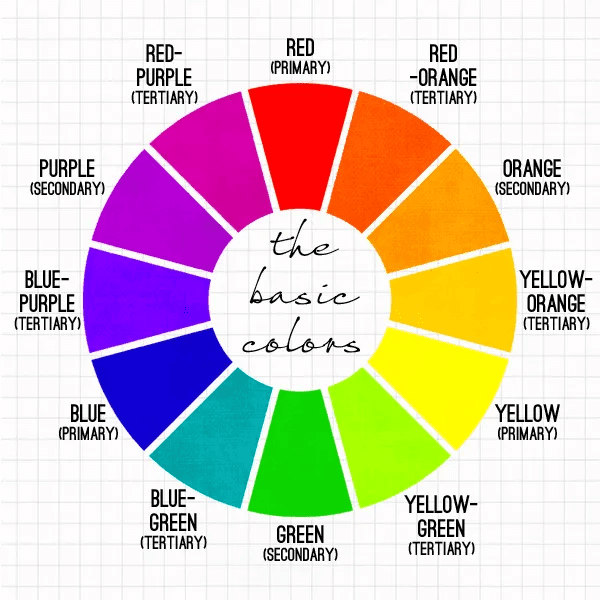
Here is the chart to understand the color wheel:

PC: Auxaitux
- Primary colors: Primary colors are “parent colors,” they can be formed with a combination of other colors, such as Red, Blue, and Yellow.
- Secondary colors: They are created by combining the primary colors above and other colors like Orange, Purple, and Green.
- Tertiary colors are made when a primary color is blended with a secondary color. The tertiary colors possess Magenta, Vermilion, Violet, Teal, Amber, and Chartreuse.
Understanding Color Wheel – Better
There is much more to the color wheel except primary, secondary, and tertiary colors. Let us learn more about the color wheel:
- Hue
Hue refers to the pigment of color. For instance- blue, green, yellow, red, etc. This variant comes in a natural state, without any variation of light and darkness. In short, hue displays every wheel color without altering light and shadow.
- Value
It is the amount of darkness, and light a color possesses. To understand it quickly, in our daily lives, we see things much closer to light with white tones, and other things in the background get dark. When a color has a value of 100%, it results in white color. And when a color has a value of 0%, its outcome is black.
- Saturation
Coming to saturation, it defines the intensity of a color. Let us assume we saturate a color. As a result, we would have a more intense and vivid color. And when we desaturate a color, we get a gray color.
One must remember to use saturation in the printed world because, in the real world, we have limitations on how much we can saturate a color. For example, when we aim to create a book poster, there’ll be far stronger possibilities in the digital world.
- Basics
Another important topic in the color world is- combination. To have harmony between two colors, a certain amount of color must exist from the other. Check out the image below; you can see the opposite colors having more contrast- while the colors have less, but somehow there is noticeable harmony between them.

PC: UX Design
The Role of Color in UX Design
Picking the right color for a design is one of the most effective UX strategies. UI UX design agencies keep “role of color” on highest pedestal. Colors are essential as they help designers influence how users think and behave. In the beginning, it can be challenging to analyze color role. But with time, understanding colors and their role gets easier.
Colors act as a primary source for designers to communicate with other users and aim to build long-lasting impressions. For example- McDonald’s uses red and yellow in its logo to evoke happiness and instant stimulation. In design, colors have several meanings, such as:
- Emotion: Colors evoke different emotions in people. For example, red is associated with passion; blue can promote calmness.
- Branding: Branding is the first thing every business must take into consideration. Using one color to convey a brand message is a traditional technique that has proven beneficial! Take the iconic Coca-Cola logo, for instance- the brand has been using red since the beginning.
- Functionality: Colors can be used to highlight a product’s functional properties. For example, an enter button is generally green, whereas a cancel button would be in red.
- Aesthetics: Colors are also used for aesthetic appeal. For example- UI designers use colors to make a beautiful design.
- Hierarchy: When it comes to color hierarchy, colors are used to indicate importance or hierarchy. Bold color is generally used for a call-to-action button to make it stand out on a web page.
Final Thoughts
Color theory plays a crucial role in both UI and UX design. It affects a user’s perception regarding a website or a product. Principles of color theory can be implemented thoughtfully to develop compelling designs that, while looking great, also effortlessly communicate the brand’s message. Understanding the color basics will help you create visually appealing designs. UI UX design services providing companies have experts working for them who can assist you with creating expectational designs.


