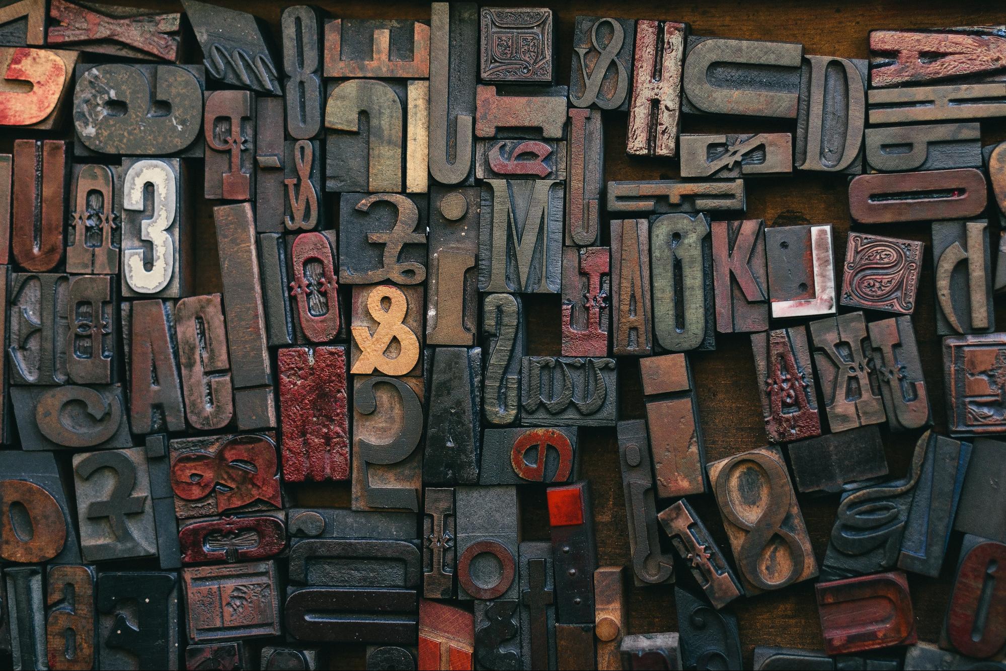
Typography, the art of arranging letters to make written language legible, readable, and visually appealing, is a fundamental aspect of graphic design. In this beginner’s guide, we will introduce you to the basic principles and concepts of typography, so you can elevate your design skills with an understanding of this powerful communication tool.
The Terminology of Typography
Before diving into the world of typography, it’s important to become familiar with some of the key terms used by designers and typographers. Here are a few essential terms to get you started:
- Typeface: The unique design of a set of characters, including letters, numbers, and punctuation marks.
- Font: A specific style and size of a typeface, such as regular, italic, or bold.
- Baseline: The imaginary line on which the letters sit, creating a uniform alignment.
- Leading: The vertical space between lines of text, measured from baseline to baseline.
- Kerning: The adjustment of space between individual characters in a word.
- Tracking: The overall spacing between characters in a block of text.
Typography in Practice: Wedding Invitations
One specific use of typographic principles can be found while creating wedding invitations. Ensuring that the text is beautifully arranged and easily readable adds to the overall charm of the invitation. Since wedding invitations often use script or decorative typefaces, selecting the right font plays an important role in setting the tone for the event. To make this process easier, you can use a wording generator for wedding invitations that harmonizes the font style and placement, making your invitations visually appealing and captivating.
Selecting a Font
Choosing the right font can make or break a design. Here are some considerations to help guide your font selection: Ensure that the font is easy to read, especially in large blocks of text. This often means selecting a serif or sans serif typeface. Consider the project’s message and target audience and select a font that complements the overall tone and style. Choose a font that is widely supported across devices and browsers to ensure a consistent user experience.
Understanding Typeface Categories
When selecting a typeface for a project, it’s helpful to understand the different categories and styles available. Serifs are typefaces that have small decorative strokes at the ends of the letterforms. Serifs are considered more traditional and are often used in print materials such as books and newspapers. Sans serif, meaning “without serif,” features clean and simple letter shapes without the embellishments found in serif typefaces. These fonts are popular in digital design due to their legibility in small sizes on screens. Scripts are decorative typefaces designed to resemble hand lettering and are often used for invitations or logos. Finally, display typefaces are designed to grab attention and make a bold statement, often used for headlines or titles, rather than body text.
Applying Typography in Graphic Design Projects
Once you understand the basics of typography, it’s time to put it into practice. Here are some guidelines to keep in mind when working on your design projects:
- Establish Hierarchy: Use different font sizes, weights, and styles to create a visual hierarchy, guiding the viewer’s attention to the most important information first.
- Limit Typeface Choices: Choose two or three complementary typefaces for a project to ensure visual consistency. Stick to one for body text, and use the others for headlines, subheadings, or accents.
- Balance Kerning and Tracking: Properly adjust the spacing to achieve a balanced and harmonious layout, ensuring that text is easily read and visually appealing.
Exploring Color
Color can greatly impact the effectiveness of your typography. When selecting colors, consider how they will interact with your chosen typeface and affect readability. For example, choose contrasting colors for the text and background to make your text stand out and be more readable. Additionally, consider the emotions and associations evoked by the colors you select and ensure they align with the message and tone of your project.
Creating Contrast
Introducing contrast in your typography can add visual interest and enhance readability. Create contrast by varying font sizes, weights, and styles. Bold, italic, and uppercase letters can be used to emphasize important words or phrases. Additionally, experiment with mixing serif and sans serif typefaces, pairing them thoughtfully to create a visually appealing and balanced design.
Mastering the Grid
A grid system can assist you in organizing your text and achieving a cohesive layout. Grids help create structure, guide the reader’s eye, and maintain visual balance in your design. Start by dividing your canvas into columns and rows, and then align your text elements according to this underlying structure. When used effectively, grids can elevate your designs and improve the overall readability of your typographic elements.
Conclusion
By understanding the fundamentals of typography, you can enhance your graphic design skills and create more effective, visually engaging projects. Keep these principles in mind as you explore the world of type and experiment with various typefaces, fonts, and layout styles. With practice, you’ll develop a keen eye for typography and be able to create designs that truly stand out.


