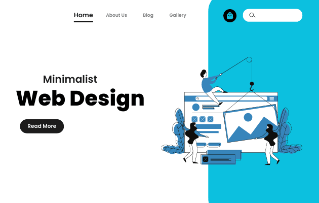
Minimalism in design has been a popular aesthetic choice in recent years. It’s also the standard in the field of digital design. You have certainly noticed the websites and apps you use have a rather simple design. Minimalist designs always manage to capture our attention.
All minimalist web design strategies share a commitment to an aesthetically beautiful design and an emphasis on user-friendliness. Removing non-essential elements from your website’s user interface design may dramatically enhance the user experience.
Minimalist approaches to design will almost always pay off in the end, and you can be certain of that fact. The minimalist aesthetic is one that will never go out of style.

What is “Minimalist Design”?
Minimalist web design is characterized by an interface with few frills that focuses an emphasis on the information itself. The guiding idea is, as we’ve established, that less is more. The ultimate objective is to get rid of everything that isn’t necessary and add next to nothing to the user’s experience.
Minimalist design is the best way to convey your intended message clearly while yet looking good. The trick is to highlight the screen’s most crucial elements.
Color schemes may take many shapes, depending on the brand’s intended audience and the message that has to be communicated. To put it another way, the information is presented clearly, without any extra frills or gimmicks.
Minimalist designers and the basic design principles they championed have reaped the benefits of the trend away from information overload and bloated design layouts. It has enabled designers to create designs that are more user-centric, therefore more intuitive and efficient.
Despite its apparent simplicity at first glance, the user experience unfolds gradually as you explore it. In minimalist design, functionality is prioritized before looks. The really remarkable, fundamental designs have little bearing on originality.
Why Minimalism Is Crucial on Today’s Websites
Some of the reasons why minimalism is important are :
A clean, visually pleasant user interface
In today’s society, aesthetics are paramount. It’s not performing its job if it doesn’t look well, right? The aesthetic value of a design should be evaluated first and foremost.
As a result, designers have been compelled to adopt a minimalist aesthetic that prioritizes ease of use. The overall feel and look of a website would be improved by adopting a minimalist website design approach.
Customers are more likely to make a purchase if the user interface is familiar and easy to use. The purpose, from a business perspective, is to deliver experiences, but those experiences should be bolstered by good design.
Flexibility and ease of use
The information mostly addresses how to create a basic user interface. Details deemed unnecessary are omitted from the display. As a result, visitors to your site will have a much easier time finding the information they need and getting started on their intended tasks. It’s possible that the bare-bones app was made in the same manner.
Keeping your design simple will keep visitors on your site longer. The straightforward interface helps make the whole thing more pleasurable to use.
Pages that load quickly
With fewer elements to load, your page will load significantly faster thanks to minimalist website design. This gives your firm an advantage over its rivals.
When a site takes even a second longer to load, visitors often give up and go elsewhere. In the end, you’ll reap the benefits of a lightweight user interface design (UX).
Responsive designs that are easy to use and understand
A website with a basic design is one that just contains the essential features and information for the user. This makes it easier to adapt your website to different screen sizes. This means you won’t have to put in a lot of effort or time to build your basic responsive website.
Minimalist web design principles and best practices
The experience and its effects on the user’s behavior are prioritized in the minimalist approach to designing products. The following are some of the cornerstones of minimalist website design that should be included in your next website project.
The area that is not being used
First of all, you’ll notice a lot of white or empty space in minimalistic designs. The term “negative space” is used to describe the region surrounding the main elements that contribute to aesthetic harmony.
Meanwhile, we call the region that isn’t covered by anything “white space.” The white space allows the key elements to stand out.
Web design and development service benefit greatly from the strategic use of white or empty space. They provide a function analogous to that of the spinal column. Ask any minimalist designer, and they will tell you that creating enough space is crucial for crafting a straightforward user interface (UI).
When did more room become a necessity? By getting rid of unnecessary items, you’ll free up valuable space that may be put to better use.
It gets rid of everything that can pop up on your screen and distract you. When designing, it’s important to leave some empty space around elements so that the composition has a visual hierarchy. It’s important since it helps people find their way around and draws their eyes to the calls to action.
The power of color in a simple layout
Choosing the right color scheme is crucial in minimalist design. The color scheme you choose for your business’s basic website will say a lot about it.
When exposed to various hues, users are likely to feel a broad variety of emotions. Therefore, you need to start by choosing colors that are consistent with the brand’s statement.
Color schemes in minimal design tend to be muted, yet using bolder hues has no negative impact on the overall aesthetic. The most important thing is to keep your website’s color pallet to no more than two or three hues.
A flair for the dramatic with little use of type
The typography, like the photographs, influences the way the audience interprets the presentation. Far more important is choosing legible fonts and putting together harmonious font combinations. As long as the fonts you choose don’t mess with the design’s visual hierarchy, you’re free to do anything you want with them.
How your product’s fonts look on mobile screens may make or break its readability. Sans serif fonts, with their clean lines and lack of ornamentation, are perfect for use in the creation of minimalist websites.
Meanwhile, the font size makes a big difference. To save room, you may, for instance, switch to a lower font size. Above everything else, consistency across font size, font style, and text length is essential.
The bare minimum
You may achieve your goal of creating a straightforward interface by performing user research to learn about your target audience’s needs. This will lead you to prioritize whatever parts of the website’s simple design get the most attention. Anything else that may be a distraction will be done away with as well.
Important information should be placed strategically in line with user behavior to avoid frustrating and annoying users who can’t find what they’re looking for. It is crucial that the intended message be communicated clearly to the web design company.
Design and Layout of a Website
Many factors make even the most basic website layout more challenging than it has to be. To make a site easy to navigate, its components and content must be placed strategically.
Additionally, grid patterns are great for producing a simple look since they provide harmony in the design. The amount of effort required to achieve a consistent aesthetic is what ultimately led to the choice to keep the website’s structure on the simpler side.
Websites benefit greatly from grid layouts due to the ease with which they may organize their content. As such, they aid in the creation of mobile-friendly websites. It’s possible for minimalist user interfaces and grid layouts to coexist.
Most essential, the information can be found rapidly. You should, therefore, place headers and the most important information at the top of the page, where they are more likely to grab the reader’s attention.
Images with a lot of color and contrast
A product’s visual attractiveness has a significant influence on the user’s mental processing. There is no way around having a simple but visually pleasing website design. in especially one that has the most fascinating and significant photos.
In the field of graphic design, visuals carry a lot of weight. High-resolution images should be used when communicating in a way congruent with the subject.
The arrangement of the pictures is also very important to the overall look. To get the desired impact on a website with a basic design, a large image in the background may be used. It’s the main character telling the narrative, therefore it stands out and makes an impact.
In addition, use images with greater color and contrast to draw in the viewer. This graphic should depict the user’s experience interacting with your brand. Although developing responsive versions might be difficult, their robustness ensures they can back up a successful minimalist product design.
Conclusion
Every once in a while, someone will ask, “Isn’t minimal too bland? ” or “Doesn’t minimal design stand the opposite of maximalist design?” Minimalist web design has the potential to fix many UX design concerns. Increasing traffic and decreasing bounce rates may be accomplished with the help of a simple user interface design.


