


Quick answer
Around six in ten website visits now come from phones, and Google has crawled and ranked the mobile version of every site since 2024. Designing mobile-first means starting with the small screen's constraints — content hierarchy, tap targets, speed budgets — then letting the desktop inherit the discipline, not the other way around.
Mobile-first stopped being a competitive edge years ago; it became the baseline. What changed more recently is that the shortcuts for faking it stopped working: Google retired its desktop crawler, slow pages bleed rankings through Core Web Vitals, and visitors who hit a pinch-to-zoom layout leave before your analytics even loads.
Here is what mobile-first design actually involves in 2026, the numbers behind each reason, and a checklist you can run against an existing site today.
1. The audience is already mobile
Estimates of mobile's traffic share vary with methodology, but the range lands between roughly 52 and 64 percent of global web traffic in 2026, and it has sat above desktop for years. The exact number matters less than the shape of it: unless your analytics say otherwise, the median visitor is holding your site in one hand, often on a cellular connection, frequently distracted.
The practical consequence is about content as much as layout. Mobile traffic rewards pages that front-load the answer, keep paragraphs short, and put the primary action where a thumb can reach it. A page designed on a 27-inch monitor tends to bury exactly those things.
2. Google grades the mobile version, period
Since mid-2024, Google uses mobile-first indexing for every site: the smartphone crawler is the only crawler, and the mobile rendering of your pages is what gets indexed and ranked. There is no desktop-only fallback to rescue a broken mobile experience. If content, structured data, or images exist only in your desktop markup, Google behaves as if they do not exist.
This also closed the gap between "mobile site" and "real site." Separate m-dot domains, which served stripped-down pages to phones, are now a liability to maintain and a common source of canonical and hreflang mistakes. One responsive design with identical content across breakpoints is the current default, and Google's own mobile-first indexing documentation spells out the requirements.
3. Speed is a ranking input you can see
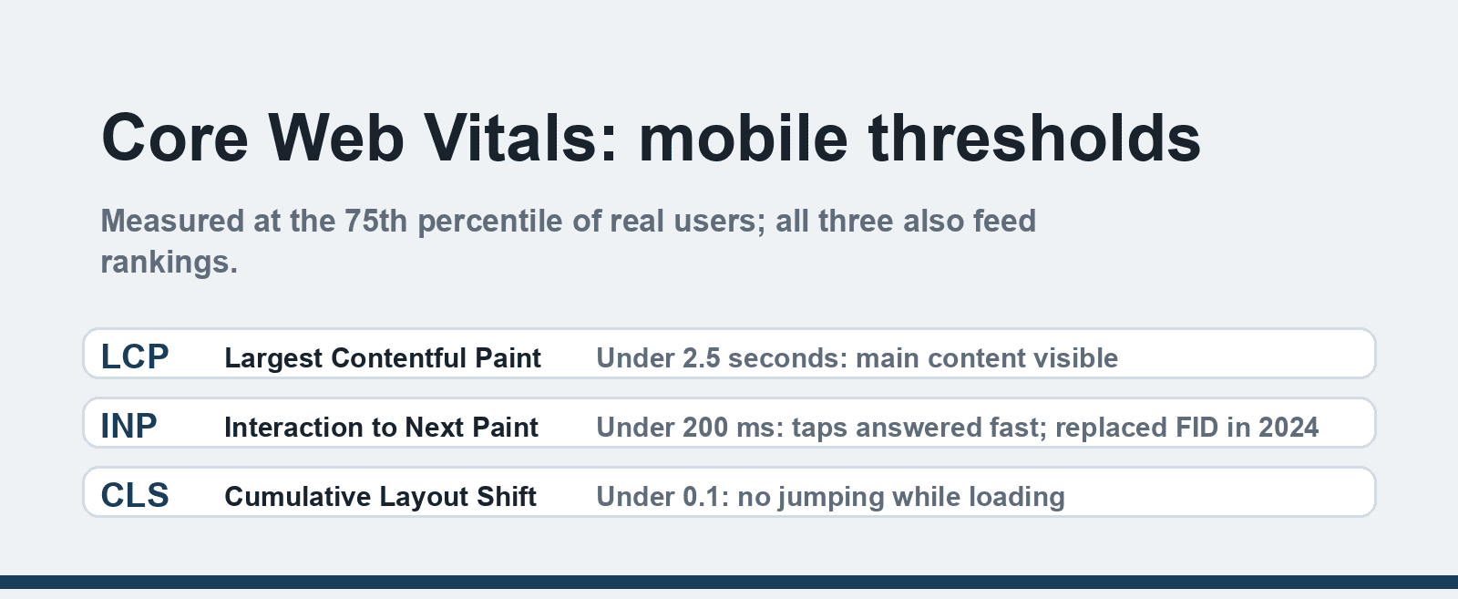
Google's Core Web Vitals measure the experience your mobile visitors actually get, and they double as a ranking signal. The three thresholds, measured at the 75th percentile of real users:
- LCP (Largest Contentful Paint): under 2.5 seconds — how fast the main content appears.
- INP (Interaction to Next Paint): under 200 milliseconds — how fast the page responds to taps. INP replaced the older FID metric in March 2024 and is far less forgiving of JavaScript bloat.
- CLS (Cumulative Layout Shift): under 0.1 — how much the page jumps while loading.
A page can look fine in your office and fail all three on a mid-range phone over 4G. Testing on a throttled connection is not optional; PageSpeed Insights and Search Console's Core Web Vitals report show the real distribution of your visitors' experience.
4. Constraint forces clarity
Designing for the small screen first is a forcing function for content strategy. If the hero section can hold one headline and one button, you must decide what the page is actually for. Teams that design desktop-first then squeeze down usually keep everything, resulting in five stacked banners, three competing calls to action, and a navigation menu that becomes a hamburger containing forty links.
The inverse discipline travels upward: build the 360-pixel version with only what matters, then ask of every desktop addition whether it earns its place. Most of the time, the answer is no, and the desktop version gets cleaner too.
5. Conversions happen where the thumb is
Checkout flows, booking forms and signups abandon at higher rates on mobile when inputs fight the user. The fixes are mundane and measurable: form fields sized for touch (Apple's guidance starts at 44-point targets, Android's at 48 density-independent pixels), numeric keyboards triggered for phone and card fields, address autofill, and a payment flow that does not require pinch-zooming to find the button you just mis-tapped.
Nothing here is exotic. It is mostly removing friction that nobody would design deliberately on a phone, but which survives when interfaces are assembled on desktop monitors and reviewed there too.
A mobile-first checklist for an existing site
1. Open the site on a real mid-range phone, on cellular, not your flagship on office WiFi.
2. Run PageSpeed Insights on three key pages and note LCP, INP and CLS against the thresholds above.
3. Check that content parity holds: nav, articles, images and schema present in the mobile rendering.
4. Tap-test the primary actions: can the most valuable button be hit with a thumb, one-handed?
5. Reserve space for images and embeds so the layout stops shifting (fixes CLS).
6. Audit the hero: one promise, one action, visible without scrolling past two banners.
If the speed leg needs work, the foundation is often hosting and theme: our fast eCommerce website guide covers the build side, our WordPress hosting guide covers what the server contributes, and our typography in UI/UX deep dive covers the legibility half of small-screen design.
Where desktop-first still makes sense
Be honest about the audience. Internal admin tools, trading dashboards, and IDEs used eight hours a day on monitors can be desktop-first; mobile is a degraded-reading mode for them. What matters is choosing deliberately: mobile-first when visitors arrive from search and social (which is most consumer-facing sites), desktop-first when the audience is professionals inside a specific workflow, and a responsive bridge when both matter.
FAQ
What does mobile-first design actually mean?
It means designing the smallest-screen experience first — content order, actions, performance — and expanding to tablet and desktop afterwards, rather than shrinking a desktop design. The content and structure stay the same across screens; the priorities and layout adapt.
Is mobile-first indexing still a thing in 2026?
Yes, and it is no longer gradual. Google completed the switch to mobile-first indexing in July 2024, crawling sites exclusively with a smartphone user agent. A page's mobile version is what gets indexed, which makes content parity between breakpoints an SEO requirement rather than a nicety.
What size should buttons and tap targets be?
Apple's human interface guidelines start at 44×44 points and Android's at 48×48 density-independent pixels, with spacing between targets so a thumb cannot hit two at once. Practical rule: nothing essential smaller than 8-10 mm on screen, and never place destructive actions next to primary ones.
Do I still need a separate mobile site (m-dot)?
No. Responsive design with the same content and URLs across breakpoints is the standard. Separate mobile domains create duplicate-content, canonical and redirect problems, and Google's documentation has recommended responsive design for over a decade.
How do I test my site like a mobile visitor?
Use a real mid-range phone on cellular first, since emulators flatter performance. Then run PageSpeed Insights for field data (real-user Core Web Vitals), Chrome DevTools device emulation for layout edge cases, and Search Console's Core Web Vitals report to see the distribution across your whole site.
Does mobile-first matter for B2B websites?
More than B2B teams assume: decision-makers research vendors on phones during commutes, and LinkedIn or search traffic skews mobile-adjacent. The mix differs — B2B sites see more desktop conversions at form-fill time — but the discovery experience is mobile, and a broken mobile site loses the first impression before any demo request.